Ufruity
While I was employed at Suite Creative, one of the tasks I worked on was for their sister company, Ufruity. The owners wanted a complete overhaul of their website and one that would reflect the new direction they wanted to take the company in.
Moving to WordPress
As the company were changing their business structure and services, the owners thought it was time to move the website over from just static HTML and CSS, to the WordPress platform.
It was my responsibility to handle the websites transition over to WordPress and to also design a new look and feel.
One of the many benefits of WordPress is its flexibility and ease of use. By using it, it gave the owners (and anyone else) a really easy way of updating and adding more content to the website.
Design overhaul
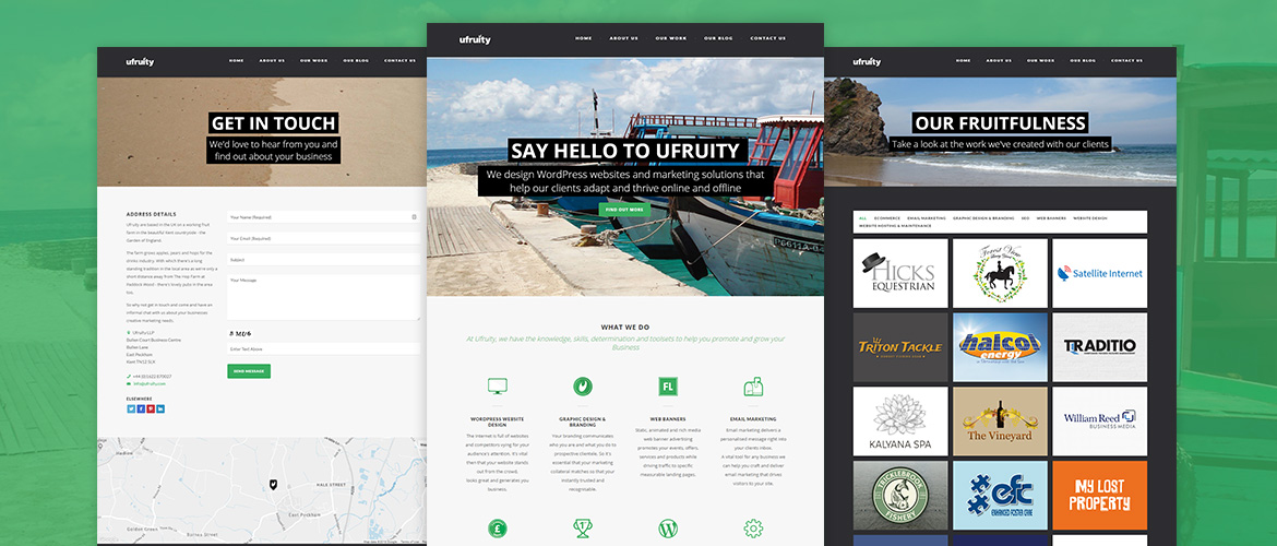
Before the redesign, the previous website was unresponsive, inconsistent and not inline with the direction Ufruity wanted to move forward in. So, it was decided that the website should provide a clean user experience, showcase Ufruity’s work effectively, be fully responsive and remain in line with their branding and ethos.
After a few iterations of designs and ideas, the finished website featured clean header images and captions, on brand SVG icons, smooth, attention-grabbing transitions and a simple way to show off the work they have produced for their clients.
The site also performed well and looked great on any device it was previewed on.
Overall, I was really happy with the outcome and it was a great feeling to know that the company owners were pleased with it too.


